Design Drawing Techniques With Top Interior Design App: Morpholio Trace x Knof Design
Awarded ‘Best Apps’ for architects, landscape architects and interior designers Morpholio Trace allows us to create a visually compelling story to convey a design vision!
I love honoring traditional methods while embracing modern techniques. - Susan Knof
When I first started out on my design career I learned how to hand-draft and run a blueprint machine. I can still smell the ammonia!!
Times have certainly changed, but techniques don’t have to.
I love honoring hand-made methods and the architectural process. No AI will replace me!
From hand-lettering to blue lines I use all my original drafting skills, but with the ease and speed of technology thanks to some great software, tools, and apps.
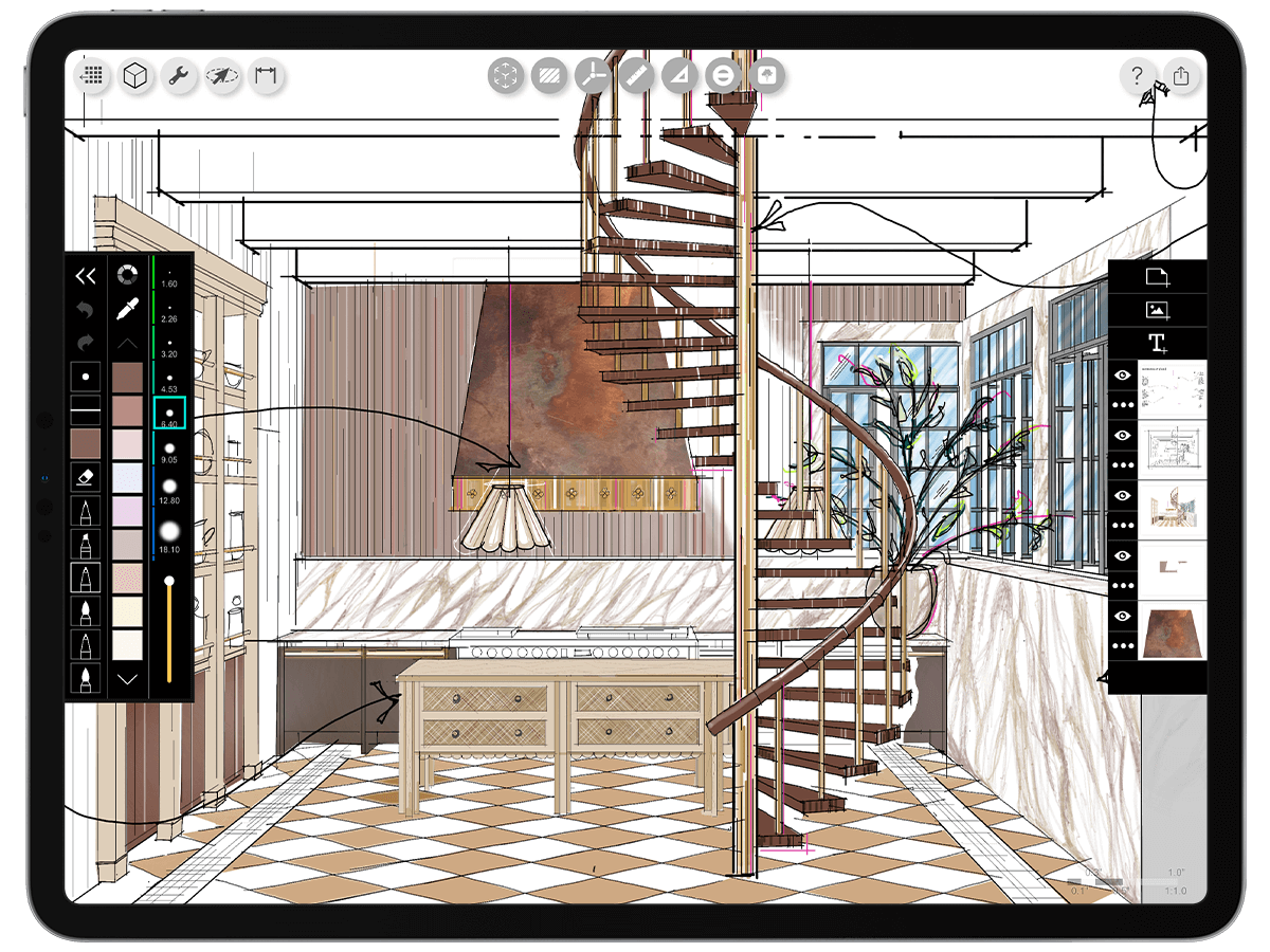
For design on the go I love MORPHOLIO TRACE I use it on my ipad pro and can work from anywhere and no ink all over my hands at the end of the day!
We recently had the opportunity to partner with Apple, Tommy Rouse, Tammy Cody, and Morpholio Trace to create a comprehensive kitchen design and drawings to convey the vision.
FLOOR PLAN BY HAND
Creating a scaled plan by hand is a great way to get a feel for your space and convey your design vision to clients.
I still love the look and feel of hand drafted plans, but they need to be done with the precision of CAD. It’s always a balance of both, form and function.
BLUE LINES
Getting everything just right is a process. I like to add a trace layer to sketch over my plan to test ideas, make notes, and get clarity before putting the final ink on.
I like using blue because in the days of hand-drafting and blueprints a non-photo or non-repro blue pencil could be used for notes and lines that would not be reproduced. Blue - lines were essential for hand lettering.
Want to learn how to hand letter like an architect? Check out our custom lettering pack with Morpholio trace.
STAY ELEVATED!
Once the plan is established it is important to look at it in elevation. Elevations help you understand a space in 3-Dimensions.
LAYERS ARE KEY!
For me layers are key to study different materials, looks and scale. Keeping things on separate layers allows you to edit better by turning on and off different layers to achieve the right look.
STUDY YOUR MATERIALS
I tend to have a play with materials and have a general plan and sense of direction on that front before I start a drawing, but the design evolves in the proces.
Mostly because as I start to draw everything out I am simultaneously thinking about constructability. How will the materials end and transition? What are the size and format restrictions? Do the materials have similiar thickness or will build ups be required. For me, this is the most important part of design. Figuring this out in the field is costly and typically results in poor detailing. Thus, my passion for drawing and designing. I like things to be smooth sailing on site.
DETAILS
From a drawing and visual communication standpoint I like to add lots of details especially the non architectural components that add warmth and a sense of personality.
ADD COLOR AND CHARACTER
These details also help to bring some life to the drawings. Architecural materials can sometimes been hard and a little neutral. Accessories can show how styling would bring in some color and character!
And if you want to speed up the process and get the KNOF look. We created a stencil pack to use on your next digital design
STAY LOOSE
Before I hone in on a specific design I like to stay loose. It’s almost like my pre-game warm up. I am not thinking too much just letting the lines be free and fluid to get a feel for the space and the different components that make it up.
BOX IT OUT
Drawing is a process. Again I go back to the blue lines on a separate layer to box out larger forms and perspective and can then break down different shapes and objects from there.
Once the forms and objects are put into place I then start to ink them out on a separate layer adding notes, line weights and textures.
CAPTURE THE DETAILS
Next comes some color and rendering.
DETAIL AND COLOR
I love to add little pops of accent color. They bring a little bit of fun and personality to a drawing.
Zoom in and there is always more detail! Electric pops of color are a fun way to bring energy into a drawing reflecting all the color that people, movement, reflections, and auras add to a space. Check out our custom made color palettes to add the perfect color combo to your next design.
VOILA!
After the plan and elevations are set it’s time for a perspective to show how all the elements all come together.
I hope you enjoyed getting to see a little inside scoop on my process. We’ve created some helpful tools for you to use in Morpholio Trace, check out the digital products here.
What else do you want to learn? Drop us a note.
Or come discover why Visual Communication is an important tool in communicating your architectural and interior design concepts and ideas!


