7 Dramatic Before and After Refreshing Room Renovations
Who doesn’t love a good before and after?
Winter is a time to focus on progress and growth and setting intentions for transformation. So when Spring comes you are ready to bloom. Your goal may feel like miles away, but with consistent steps anything is possible.
We thought it would be fun to look at some of our favorite before and afters to provide some inspiration and motivation! Sometimes our projects require a cosmetic touch up while other times a full transformation is required.
Today we are taking a look at cosmetic touches transforming complete room by rooms makeovers.
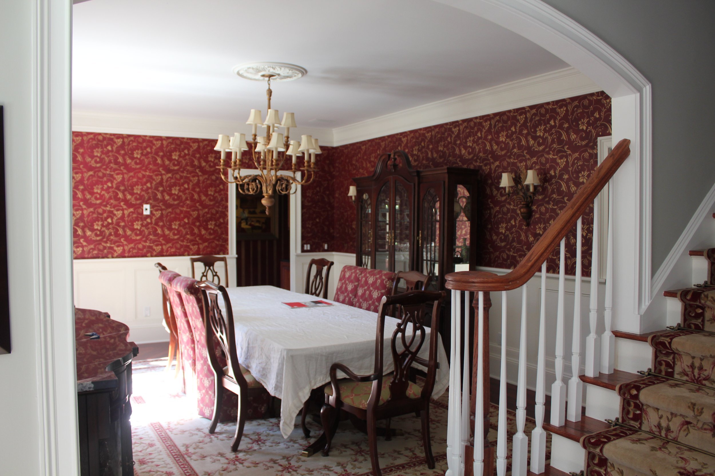
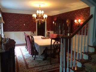
BEFORE DINING ROOM
AFTER DINING ROOM
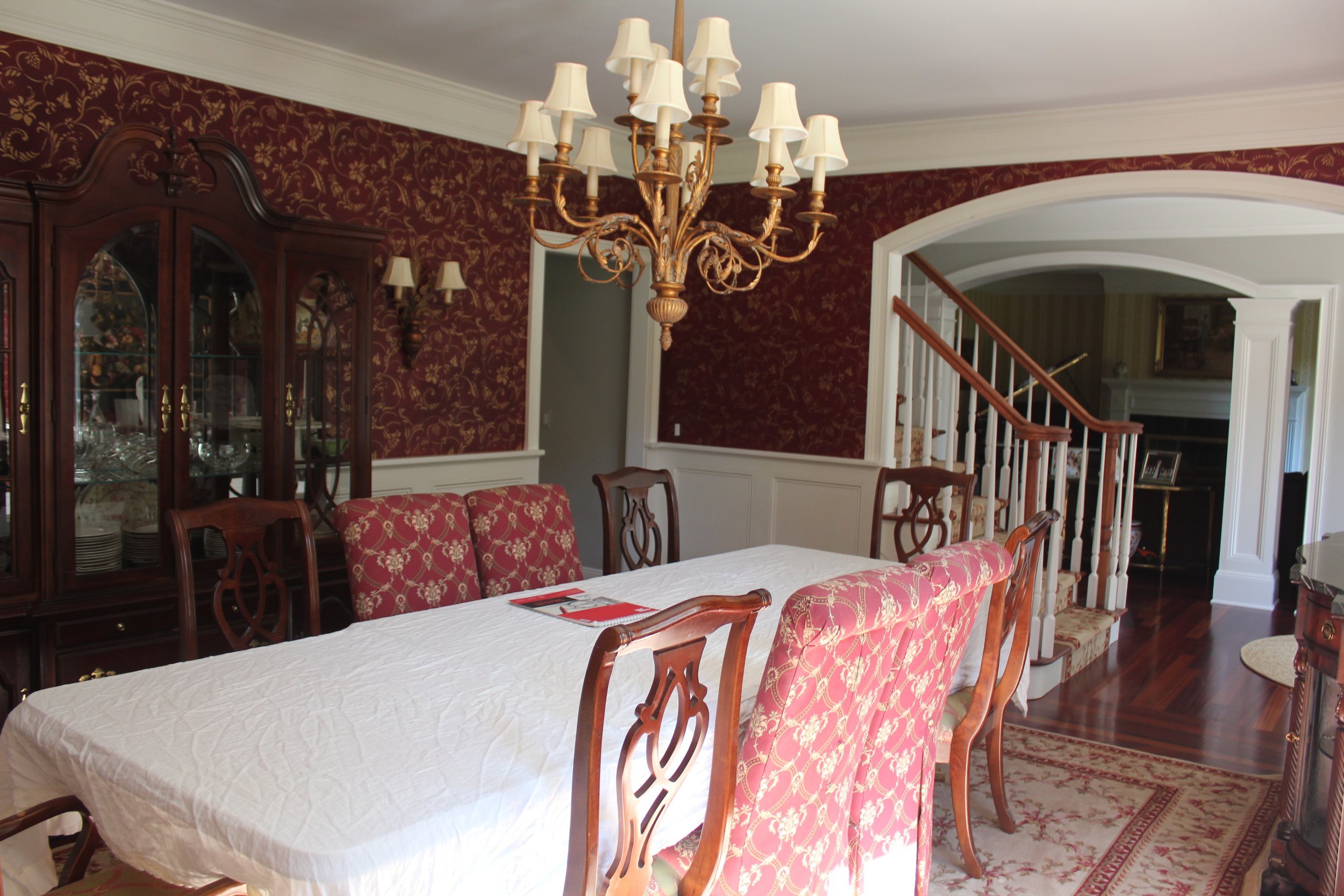
This property had good bones and the clients did not have any programmatic changes to make. They had the rooms and sizes they wanted, however, they were out dated. Trends come and go and heavy colors can make a space feel, well heavy. We decided to lighten the mood with new hues!
BEFORE DINING ROOM
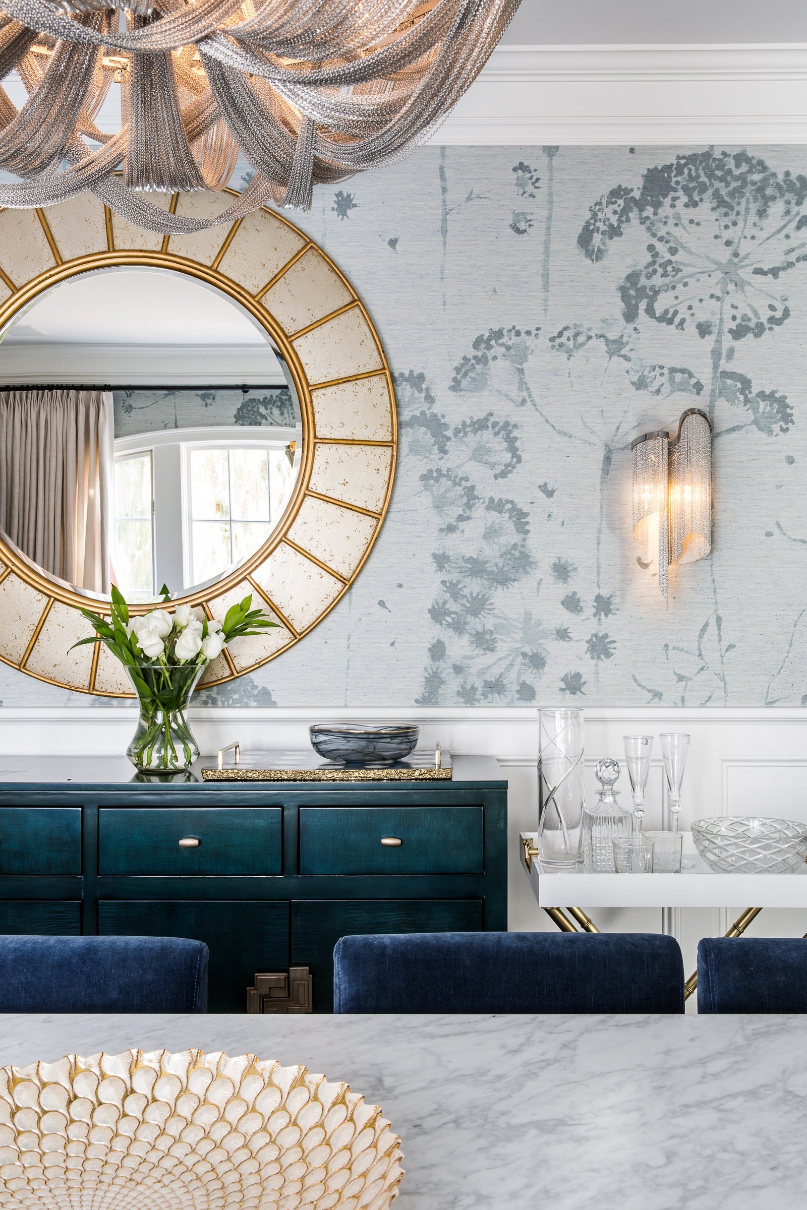
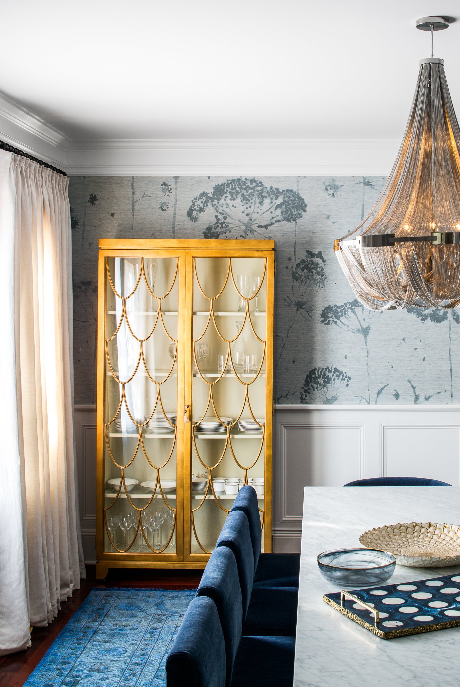
We took a fresh look at this dining room and by introducing a monochromatic blue scheme the whole space felt more up-lifting. The dramatic large scale floral print wallcovering by Phillip Jeffries offers a calming botanical blue relief.
A traditional rug from abc carpet & home providesa touch of heritage to an otherwise more modern approach to the whole space. The mixing of metals was intentional to work with existing hardware throughout the home while also adding some new gold tones to offer warmth to the contrasting cool blues.
AFTER DINING ROOM
The Cosmetic Before and Afters Continue
This traditional sitting room was in need of a new look. We wanted to ensure the new design had a symbiotic relationship to the dining room as the two sit opposite one another with a large open foyer in between meaning the two spaces visually connect and also function well together when entertaining.
BEFORE SITTING ROOM
Some of the main design decisions revolved around scale and placement. The room had a tricky layout with a fireplace, large window, large open entry to foyer and with an additional doorway to the rear hallway there was little room for furniture placement.
AFTER SITTING ROOM
Another key piece that was off scale was the area rug. The clients didn’t want to refinish the wood floors as it would mean refinishing the wood floors throughout.
The simple solution to help eliminate the strong dark red tones of the existing wood floors was to add an over-sized area rug to not only help with the overall color palette, but it also allowed for all the pieces of furniture to stay connected under one flooring.
New full length delicate linen curtain on a wall mounted bracket hung just under the newly painted cornicing helps create an illusion of a larger window opening and offers an elegant back drop when they are drawn. A rich custom blue velvet tufted Chesterfield sofa and Shagreen nesting side tables add elegance and glamor!
FAMILY ROOM BEFORE AND AFTERS
The next room to tackle was the Family Room. Situated at the back of the home with large french doors and natural light and adjacent to the kitchen we wanted the space to feel light, bright, and open.
“I loved the existing white painted timber beams which gave depth to the ceiling. I wanted to maintain this feature.”
To lighten up the space while maintaining the existing timber beams was a simple, yet effective solution. The ceiling was painted a subtle neutral Wimborne White Paint by Farrow and Ball to match the new linen wallcovering.
One of the best additions to the space was a full height photo gallery wall meticulously measured and custom framed with dark taupe linen mattes and an antique paint finish. This offers variety, depth , and above all provides personality truly making a house a home.
BEDROOM BEFORE AND AFTERS
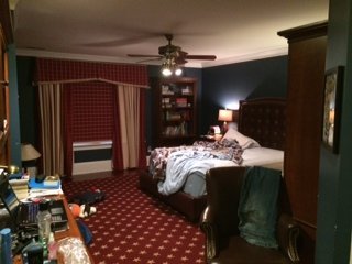
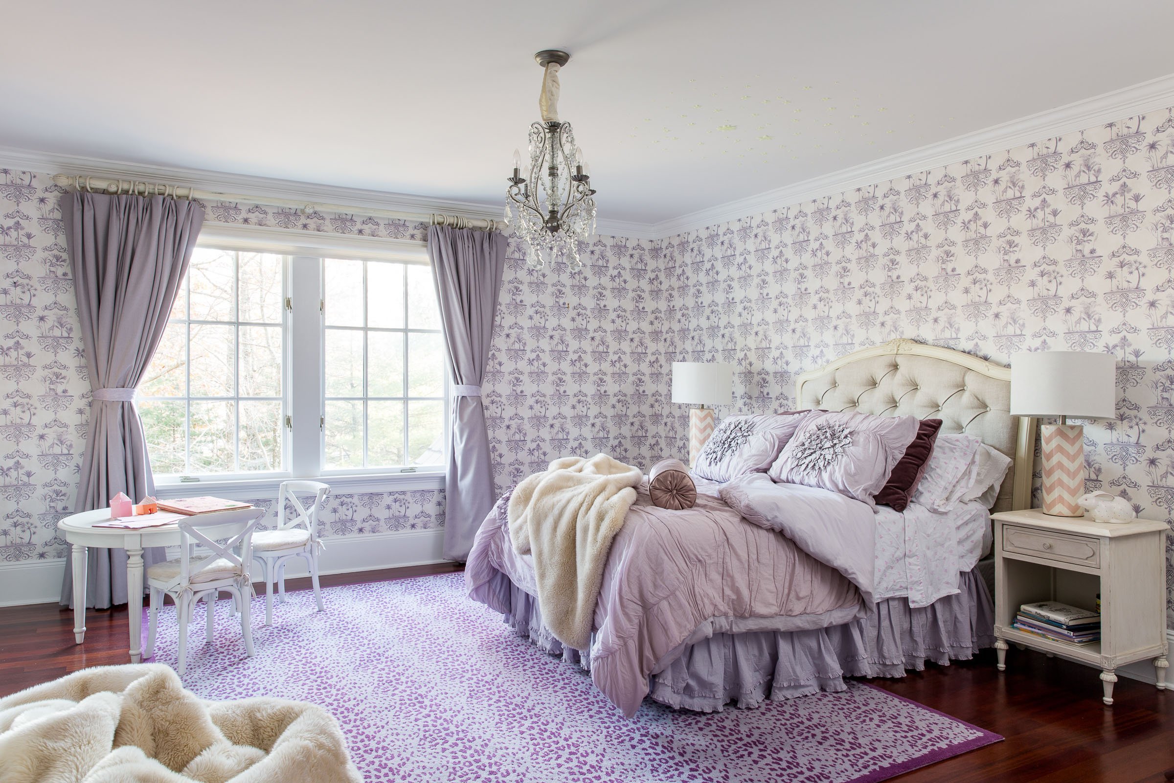
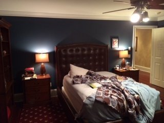
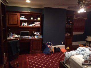
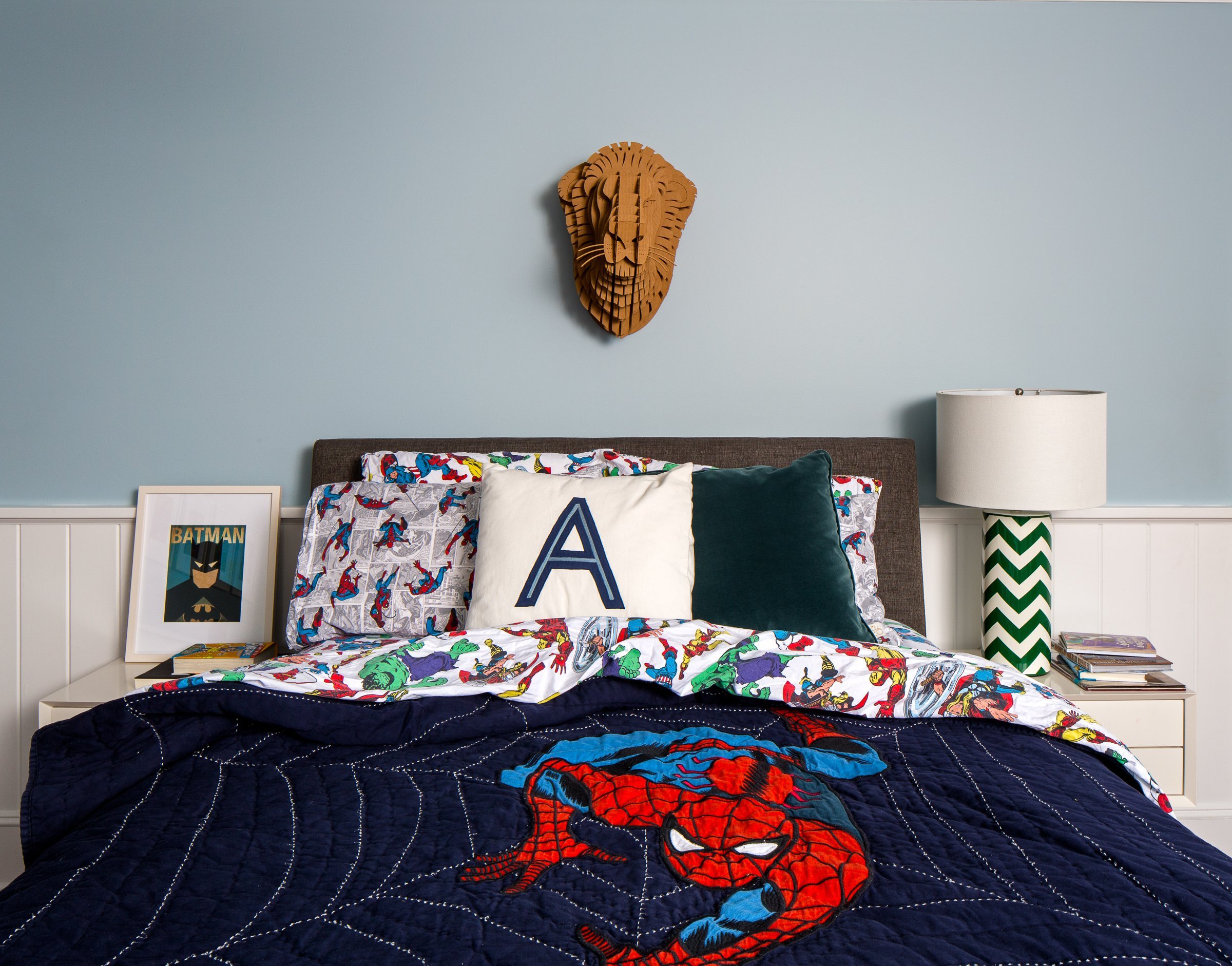
Transitioning this teen boys room from dark colors and lots of clutter was a fun task. We wanted not only lighten and brighten the room to create a young girls room, but we wanted to ensure we provided storage to avoid visual clutter.
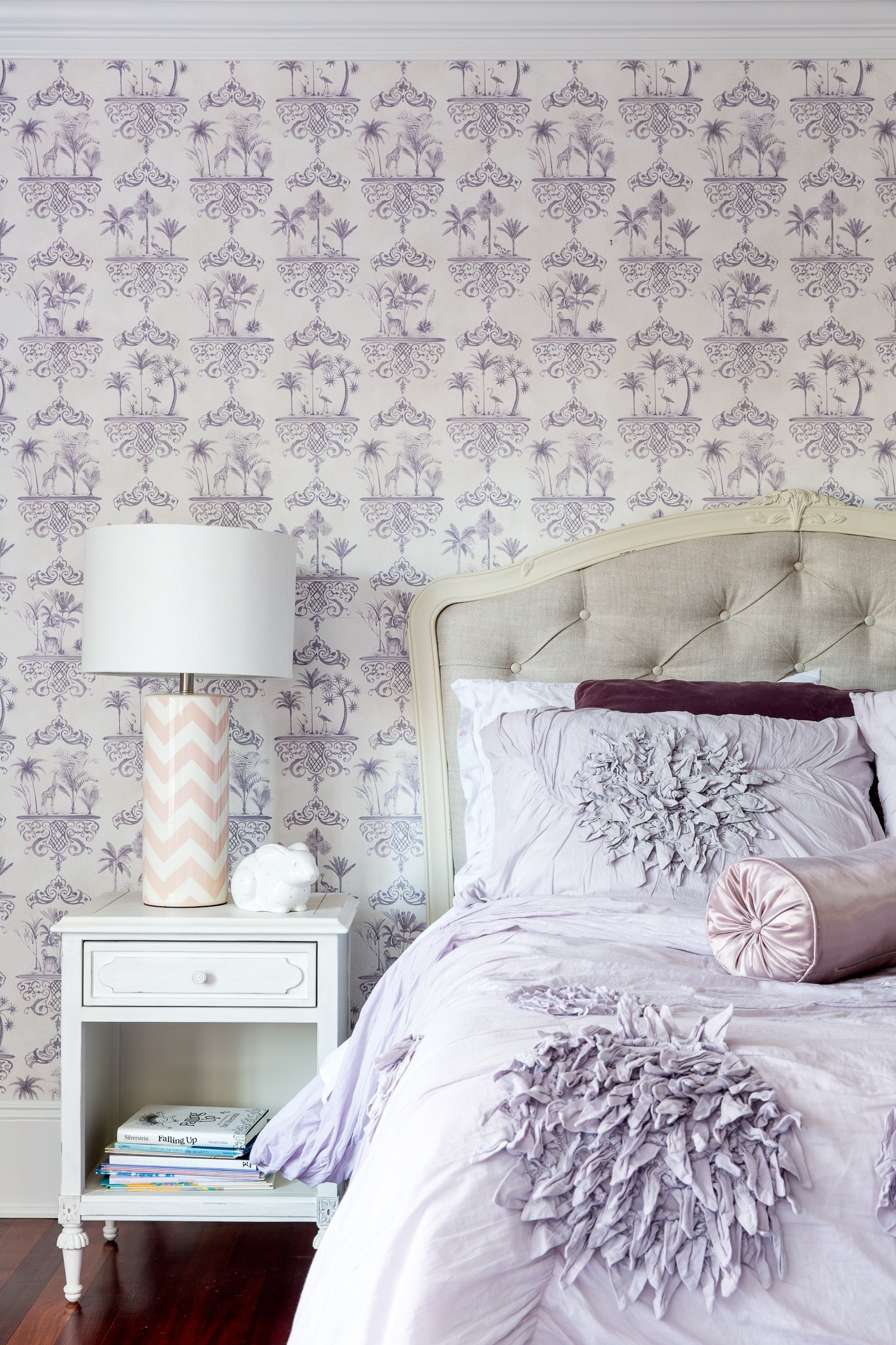
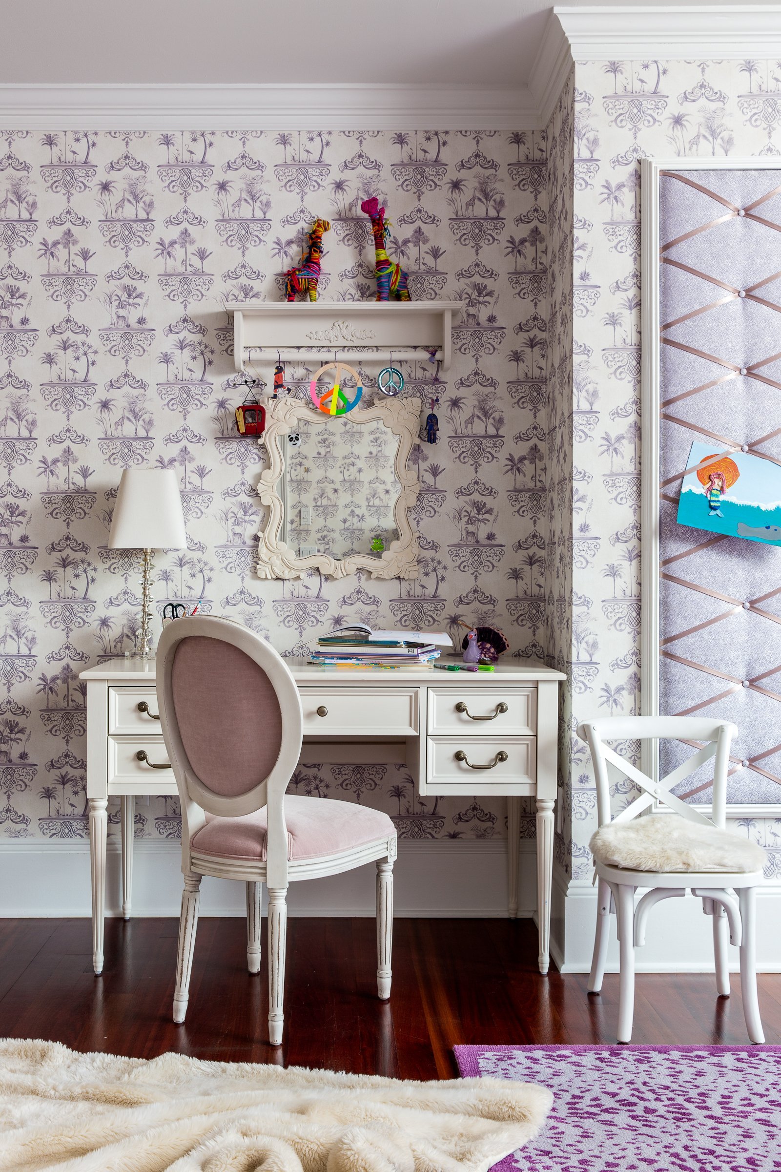
A monochromatic purple palette helped to soften the overall look. Fresh patterned wallpaper provides some visual interest, depth, and personality. We immediately fell in love with the Rousseau wallpaper by Cole and Son. It is a graceful cartouche design featuring painted scenes of exotic palm trees and animals on a delicate craquelure ground drawn from porcelain tableware of the 18th and 19th centuries,
Another fun incorporation was a bespoke wall mounted pin up board with a beautiful patterned fabric back, deep buttons and satin cross ribbons so all artwork and keepsakes can be easily displayed pin free.
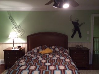
BOY’S BEDROOM BEFORE AND AFTERS
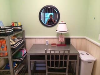
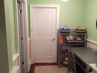
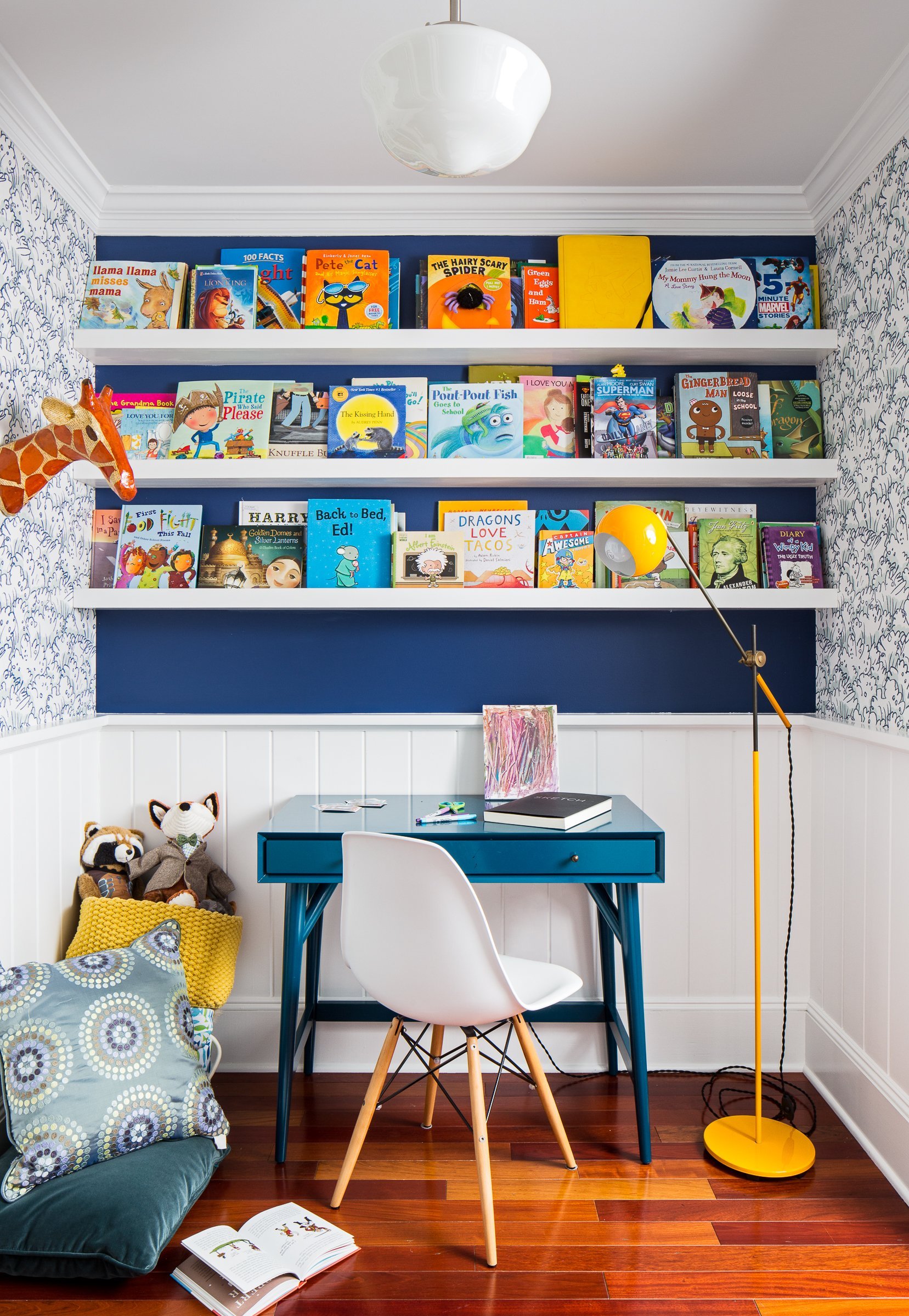
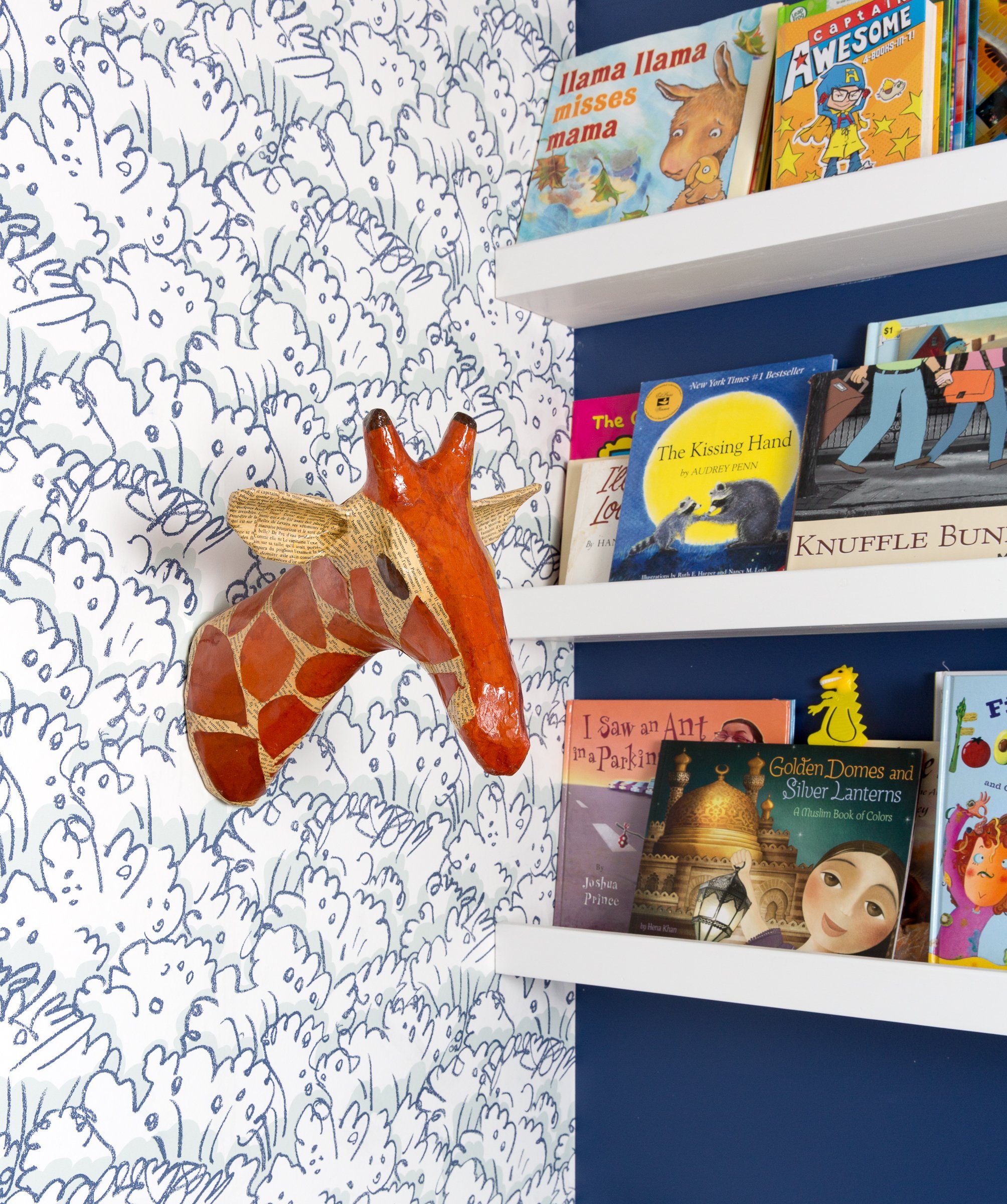
We believe space affect your mood. Therefore, it was essential to turn this study nook into a clean and inspiring area.
Full-length custom book shelves with a front lip to prevent books falling from the shelf were introduced to keep the desk space clutter free. As the child ages the shelves can be used for art, trophies, framed awards, or whatever inspires! A small blue desk is centered below with enough space above to allow for a full height monitor when the time requires. The area was also kept clean for a larger desk when needed.
PRIMARY BEDROOM BEFORE AND AFTERS
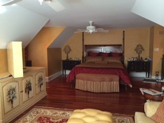
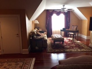
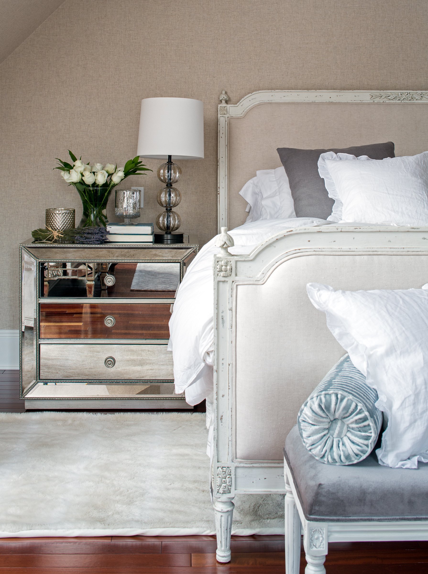
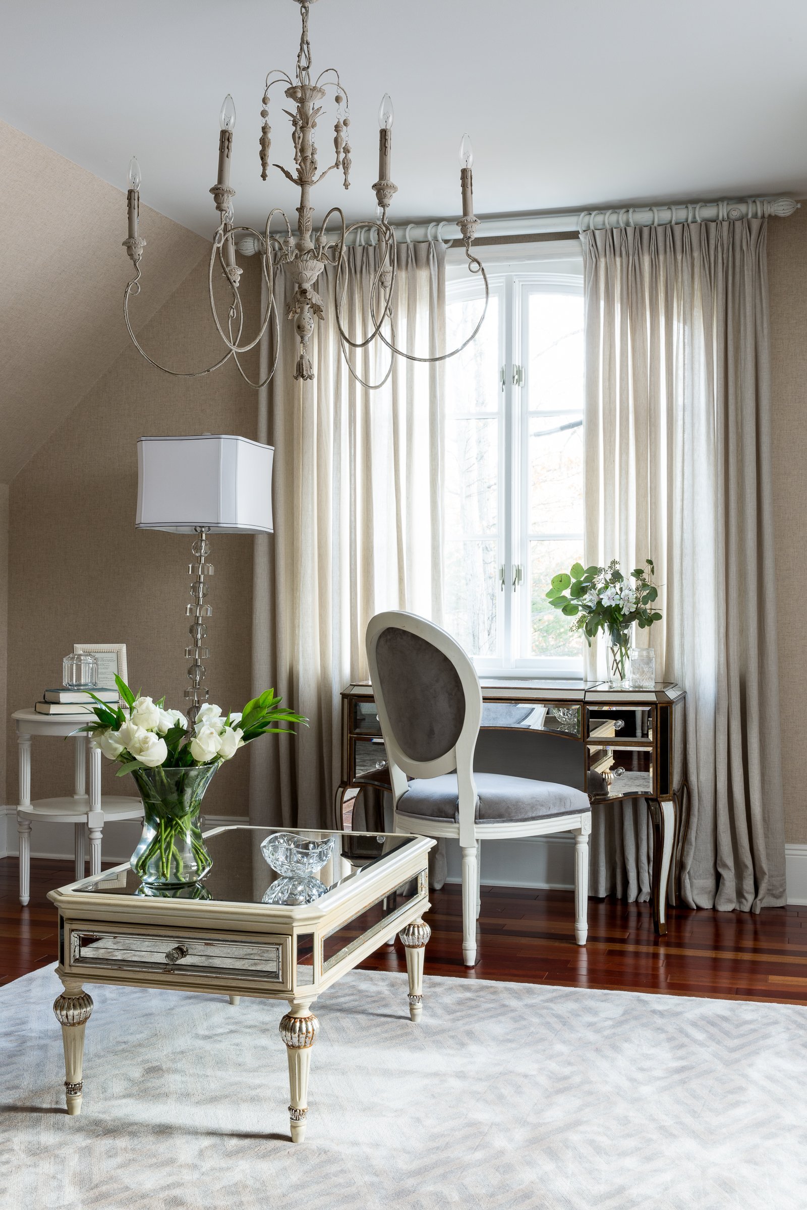
Adding light colors, soft materials, and reflective surfaces lightened the mood all around. It’s always interesting when you have angled ceiling lines to work with. Are they walls or are they ceilings?
I always treat them as walls and continue the wall surface material along the angled walls. This helps to lengthen the space and draw the eye up to the ceiling rather then stopping midway at the surface change. If using a wallpaper especially a fabric one it is critical to have a specialist decorator that is trained in working with natural woven wallcoverings.
New mirrored bedside tables compliment a mirrored vanity table that i located at the opposite end of the room. The reflective surfaces allowed us to use larger scale bedside tables without feeling cumbersome.
For a soft and elegant feel I love using natural fabrics. A flax linen chambray by Pollack was used.
HOME OFFICE BEFORE AND AFTERS
This is a work in progress set, but excited to share this mid-way makeover. This working woman needed a new home office to inspire.
BEFORE photo of Home Office
This is still a work in progress, but excited to share this mid-way makeover.
The first changes were to lighten the walls and provide a little texture with a new wall covering. A new velvet pink sofa, custom cushions, a stunning animal print rug by STARK carpet a sculpted glass pendant light, capiz shell fronted media cabinet which now houses a printer and office supplies and custom built floating shelves housed within an existing wall recess gave this work from home office a whole new look - and outlook!
We hope you enjoyed a little look at our transformations and it showed you the amazing power of space!
Much of our life is out of our control, our home is a place we can control and create. Whether you are personally a minimalist or a lover of a maximalist approach, or like most fall somewhere in between, the way you furnish your home, paint your walls, arrange artwork and items of sentiment will all have significant impact on your sense of security and overall well-being.
Many interior design techniques and approaches have been shown to reduce stress and depression.
The effects of sunlight, expansive space, greenery and fresh flowers, color, and artwork have been extensively studied. When used correctly, each of these design elements can create an environment conducive to reducing stress, anxiety, and depression.
When our spaces look and feel good, so do we!


